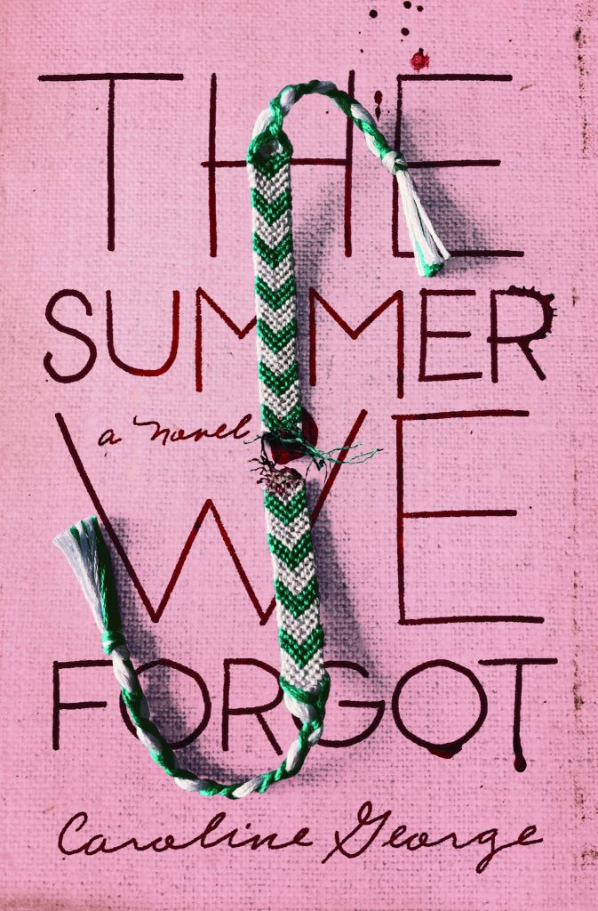
The Summer We Forgot

Publisher
Thomas Nelson Publishers
Designer(s)
Faceout Studio, Tim Green
ISBN
9780785236214
Other Credits
Art Director: Halie Cotton
Judge Comments
This cover worked really well for its corresponding genre within the world of fiction and contained a surprising element. Being able to represent a genre in a non-generic way might be a difficult task, but this cover design met the challenge with skill and precision.
Unique, displayed originality and executed strong creative visual concepts that are appealing and standout in the marketplace.
The composition is great with the bracelet overlaying the typography and pulling the eye through the text. The imagery is recognizable and memorable. Feels like a bestseller.
Visual concept and execution made my vote. (hard return) The juxtaposition of the broken friendship bracelet against the title draws the reader in with curiosity of what did happen that summer. The custom title typography and hand lettering with subtle splatter elements is very well-crafted.
The Summer We Forgot is aided by flow and layout that quickly leads the viewer to understand that this cover is depicting the severed nature of some human relationship. It is raw, gritty, all the while controlled—not trying to say too much to quickly or too on-the-nose.
An impactful design clearly aimed at a YA thriller market. (hard return) Great Integration of the tattered shoelace with conceptual typography on an unexpected pink background is intriguing, drawing me in.
Full of emotion from the type to the way the bracelet stands out from the page. The concept is clever and relatable.
Uses unique visual elements that visually hint at the story without telling it in detail.
Literary Category
Fiction
